Happy Thursday Everyone.
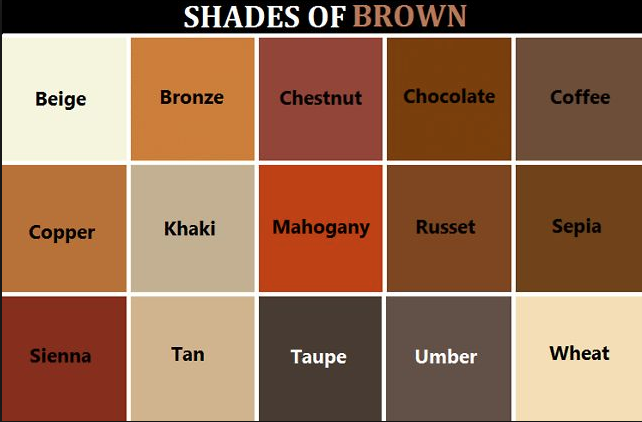
I hope this post finds you well. For today’s door post, I have a brown theme with doors from Richmond, Virginia. As I was thinking about how to share them, I thought I would start with this little color chart:
Let’s start with this door; the actual door seems to be a deep chestnut and around the door we have multi-color (brown family) bricks and tiles.

Detail of the tiles:

Copper/bronze and brown in the gate; Beige/wheat door

This next one I am going to call “deep khaki” because this is just an informal color match. So a little grace here, ok? 🙂 (And a mix of browns in the stone)
This wood door has a nice yellow-ish brown
More wood doors, which are large reddish-brown doors – and the floor has contrasting browns (wheat, coffee, and taupe – maybe?)

Lastly, a dark chocolate kitchen door (and can you see the pepper grinders – in russet brown…)

There are so many different variations of brown – and I had fun looking at different names. I stumbled upon this nice article from Rebecca Gross (here). It was an article about color meanings and “branding.” Rebecca said that brown comes across as organic, simple, and honest:
“Brown gets a lot of use in this era of organic and natural food, beauty and products. Nature inspired it represents a feeling of wholesomeness, orderliness, and being grounded. It is simple, strong, durable and honest and may express that your brand has better things to care about than superfluous color, when really… (mind trick!).”
Well that is all for my door post this week.
To join in with Norm’s Thursday Doors, or to just see other entires, go HERE
Have a great day!
![]()
.
.
.
.
.
.
.
.

I am going for “the blog with the weirdest doors” category 😀
LikeLiked by 2 people
well I accept that nom dear Bushboy.
LikeLiked by 1 person
Yvette, who knew brown could be so interesting! I love the tiles round the first door and I’m fascinated how an ordinary looking door can look so very striking when photographed on its own.
LikeLiked by 1 person
We had a terrible building craze in the 1960s to 1970s where all exterior paintwork was ‘mission brown’. Never want to see brown on house exteriors again 😉
LikeLiked by 2 people
well thanks K – I was wondering if it all started before the 70s and so you confirmed this – the 60s had those earth tones leading to the many browns, oranges and greens of the 70s –
and I can understand why you do not want to see brown exteriors – 🙂
LikeLiked by 1 person
Funny stuff, Yvette. The exterior of every new and/or redecorated house in the vicinity is now shades of grey. Is that a global trend also? I can feel a post coming on 😉
LikeLiked by 1 person
oh please go with a post on this.
I see tons of gray here too (I think I spell my gray with the a)
LikeLiked by 1 person
I’m OK with that as long as you accept my ‘u’ in colour 🤣🤣🤣
LikeLiked by 1 person
but of course…
🙂
and talk to you soon K
LikeLiked by 1 person
Brilliant! You’ve done a grand job of showcasing brown!
LikeLiked by 2 people
well thanks so much, Sue
LikeLiked by 1 person
I believe that there should be a “Brown Day” For Yvette.
Although “wheat”?…… That looked to me like white.
LikeLiked by 2 people
I agree – wheat should have a bit more tan or yellow – maybe?
and thanks for dropping by CP1
LikeLike
love ya
LikeLiked by 1 person
xxoo – love ya more amigo
LikeLiked by 1 person
Got me thinking! (A difficult task but you dd it!) I suppose I hadn’t really thought about how many variations of “brown” there could be. Great photo examples! I just looked around the family room where I’m sitting and spend time in every day and am amazed at how many variations of brown there are in here! Who knew? LOL! 😆
LikeLiked by 2 people
I feel similar, L.
and then there are different names for these browns – depending on the field of work – like painters have names for paints – hair stylists have their colors for dye – and nail polish, etc.
LikeLiked by 1 person
What an interesting theme for a doors post. Very well done. I really enjoyed this, Yvette!
LikeLiked by 1 person
thanks so much dan – I had about ten door photos in a folder (to use up) and when I skimmed them yesterday – the brown and muted warm tones jumped right out at me – and so thanks for the feedback. also – it all started with that old fashioned tile around the first door – so – um 70s? or earlier
LikeLiked by 1 person
I love brown and this post was interesting.
LikeLiked by 2 people
thanks for reading, Diana – and I had so many different brown label charts to choose from – I finally went with the one here – it was tough –
LikeLiked by 1 person
You’re welcome and I’m glad you went with this one. 🙂
LikeLiked by 1 person
🙂
LikeLiked by 1 person
It’s wonderful to see, amigo, the shades of brown. That helped understand and match the varied hues of brown. When I see words like russet and sepia I open my dictionary not knowing they are shades of brown. Interesting doors collage 🙂
LikeLiked by 2 people
Hi Mahesh—- ahhhh – so nice to connect my friend.
miss ya – and thanks for the feedback – I feel that way too – still learning how this chart labels this shade – hm
LikeLiked by 1 person
I love browns. Natural shades are the best colours. But lord above, the person who fitted all the interior doors in my block of flats chose a… Poop brown… For every single door haha!
LikeLiked by 2 people
ha ha – lmao – poop brown .
and on every door – maybe little fears can have a play on word piece with that one (thx for reading mate)
LikeLiked by 1 person
This is funny – my door is a deep dark chocolate!! 😄
LikeLiked by 2 people
That sounds like a very nice brown to have on the door….. 🙂
LikeLiked by 1 person
Thanks, Y! 😄
LikeLike
Those tiles around the door have a very retro vibe! My husband lived in the Fan during his college days at VCU many, many moons ago. 🙂
LikeLiked by 2 people
well then you know exactly the neighborhood these are from…
thanks for dropping by
LikeLiked by 1 person
Great shots. I loved your idea for a sub-theme related to color. Nicely done 🙂
LikeLiked by 2 people
thanks N
LikeLiked by 1 person
This is a wonderful way to frame your door photos. [No pun intended.] I adore the tile around the door in the first photo. That’s something I don’t see around here, ever.
LikeLiked by 2 people
Hi ally bean – and thanks for the visit – I like how you said “frame the post”
ha – good one
and also – the tile is what stopped me in my tracks. We were on our way somewhere but I made sure to get a photo (or two).
I think it is from the 1960s or 70s
LikeLiked by 1 person
The combination of browns in the next to last image are beautiful! I
f we are ever going to paint our front door (not a priority right now) I would like it to be that kind of red/brown. Already for half a year I’ve been giving my kitchen cabinets the evil look, because I hate the orange brown they are, but am going back and forth between Bordeaux red, or white washed pink-ish. i’ll hit post comment before I make this a chapter:):)
LikeLiked by 2 people
well thanks for sharing Jesh – and the white pinkish sounds interesting and bright. I bet it is sooooo hard to choose. On eof my favorite looks for cabinets are the really tall ones in white with black and gray ish bits – I have only seen a few sets that have it = and it is hard to explain and I wish I had taken a photo.
and I will end my reply before it becomes a chapter too –
but thanks again fro the visit – and the front door in red/brown (at the right time) sounds nice….
LikeLike
we’re talking about colors… if it were hubby, for him how well the cabinets were constructed would be all that mattered, lol.
LikeLiked by 1 person
well your hubby does have a good point – because quality is important eh?
LikeLike
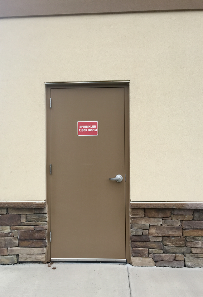
What a great door for that “sprinkler riser room”
LikeLiked by 2 people
🙂
LikeLike
Really enjoyed seeing and appreciating the shades ✨
LikeLiked by 2 people
thanks for dropping by Dr. Perry!
🙂
LikeLiked by 1 person
Nicely done! These are interesting. Fond of the brown tile beside the brick, and particularly fond of the second grate door with the plant behind. I love that one.
I’m a fan of brown, but not of the era where everything was brown, much like how everything is gray now. Overdone. I do think brown is grounding, simple, and honest, as well, look at wood. Must be 20 shades of wood in my house alone. What’s more wholesome than wood?
LikeLiked by 1 person
this went to spam for some reason….
and i agree – wood is so wholesome and I love when they are many types – so enriching to have 20 in your pad.
and also agree that gray is so overdone these days –
LikeLiked by 1 person
Definitely a new angle on the theme. 🙂 Good one.
janet
LikeLiked by 2 people
thx Janet
LikeLike
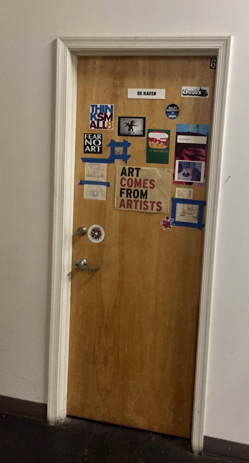
“Aer comes from artists.” GOOD FIND!
LikeLiked by 2 people
thanks Mofman
LikeLike
I always love your doors posts, Yvette! This time I was captivated by the different names for brown! so poetic! Russet, chestnut . . . wow!
LikeLiked by 1 person
I loved your shade card 😀 And I spent the most time on the first door which you called chestnut but i thought it was white until I deduced you were talking of the door behind the glass door right?
LikeLiked by 2 people
correct amiga
and thx for the visit and comment – ttys
LikeLike