This week for the Lens-Artist Photo Challenge, Amy invited folks to share images of negative space in photography. Amy shared this: Negative space is the area around the main subject of your photograph. This space is empty or unoccupied. Spencer Cox at Photography Life explained it this way: Photos with high amounts of negative space are: empty, subdued, peaceful, calm, and isolated.
***
Isn’t it fun to talk about negative space this week?
Here are some more thoughts to add to this rich discussion – as we all learn and grow when these themes come our way 🙂
The negative space (in a photo or printing) lets us breathe and pause – like margins in a book or like a pause during conversation – the negative space can give us some (visual) room.
However, sometimes the negative space brings us into the photo – around and into the subject, and then deeper into the composition.
Sometimes the negative space is a VERY active part of the energy and movement of the entire photo.
We all see and feel the impact of the negative space – even if we cannot put it into words.
The negative space can work with the subject and other elements to allow us to experience something – it can be calmness and peacefulness – OR it can be an engaged and “pulled in and around” vibe too.
*
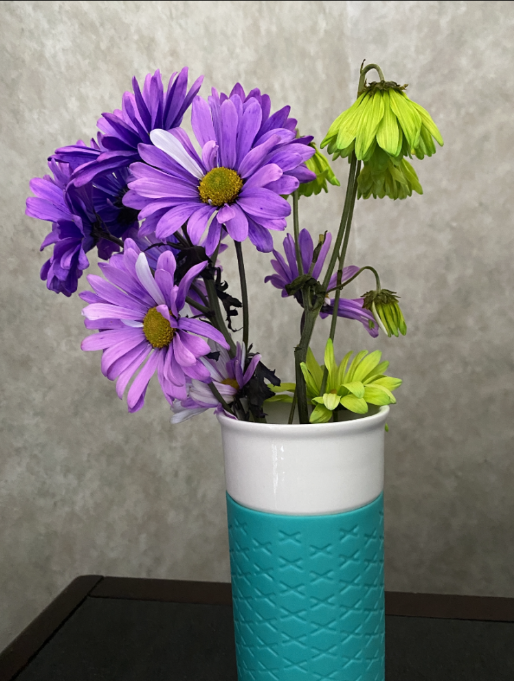
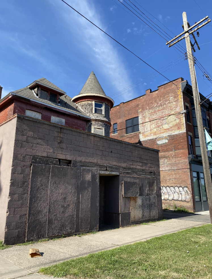
1) The hotel wallpaper fills the negative space in this flower photograph. (These were birthday flowers, by the way – from earlier this year – and they were from a California cousin of mine). However, notice that the negative space also has the dresser line and angle. This could be viewed as part of the subject – our still life of flowers in a ceramic travel mug. However, the line and angle in that lower left – and the darkness of the wood – allows the wallpaper to glow a bit – and then the corner is contrasting with the rounded flower to the upper right – you can almost see a line through the photo from the lower left to the upper right. Then the stem lines also have harmony with the dresser line. I also like how the center of the left purple flowers has a similar color to the yellow-green flowers right. here are the flowers without the dresser – and I think it has a much different vibe. What do you think? 2) The negative space here would be the sky. And again, I feel as if the negative space adds to the energy and movement of the photo. The white lines in the sky seem to radiate – and their soft, organic feel add a nice contrast to the straight lines and geometrics in the building, sidewalk, and pole. The organic shapes in the sky also helped me feel some of the organic shapes found in the weathering of the bricks and wood 3) The negative space here also lets us feel some hotel wallpaper. This time, the stripes of a neutral wallpaper allow this cowboy figure to stand out. The corner of the wall gives us depth – and then the negative space also allows us to feel the shadow – with the arms and lasso – drawing the eye back to the subject.
***
These next two photos remind me that a slight change to the negative space can CHANGE the energy in a photo. Let me know what you think:
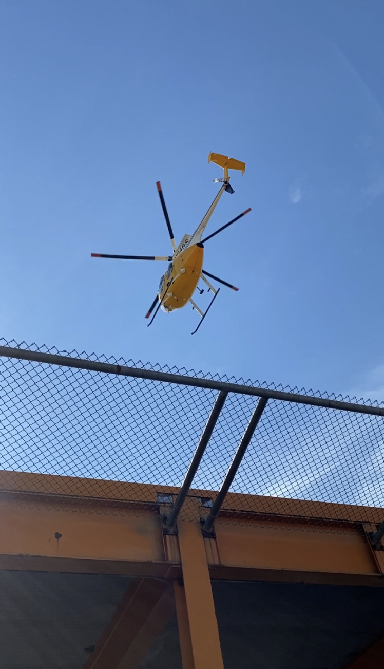
4 A) – The Negative space here is top heavy – make that – the negative space is “top light” — as the clear blue sky fills the upper part of the frame. There is an “up and away” vibe.
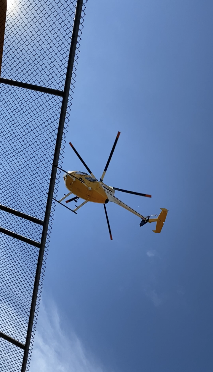
4 B) The Negative space here fills the right – and then we have the white corner upper left and white in the corner lower left. The sky here in this photo is only a little different from the first one; however, the energy is totally different. I think this photo of the helicopter is less calm then the first – and this one has more of a “coming in for a landing “feel.” Hmmmm == just thinking. And it can be fun to ponder different elements – so thanks Amy.
Care to join in with the Lens-Artists? Here are the links:
Hi – well thanks a lot and I am learning so much this weekend with the various entries for the theme of negative space 👍🏼😊
-also – notice the flowers are rather a thin bunch – I shared half the bouquet with my cousin’s elderly neighbor ! Just had to– 😉
I think the second helicopter shot has a more calm feel because there isn’t so much else in the photo. Am I being negative? LOL! Is that your sculpture? We have some western sculptures and my parents have many of them. Happy Sunday, Yvette.
Hi Janet – not negative at all – because it is all so subjective – eh? And it is “all how we look at it” and I could change my mind next week – plus sometimes the way we “read” a photo or feel it – well we can be “primed” from our day or from what we have recently done – and so then coming to a photo can change depending on that frame of mind –
And no ma’am – that sculpture was one of maybe 25 sculptures at a hotel – they were well made
Happy Sunday to you also
Beautiful set of images of negative space, Yvette. Well captured and explained that help us appreciate these beautiful images of the flower arrangement, sculpture, old building, and helicopter.
Hi – cheers to the flowers and I loved your pro tips for food photos – that was really well
Done!
And a top tip for me was
Pick good surfaces what’s under the plate matters, while marble, wood and fabric are great, you’re concreate patio could be even better”
And would just add to maybe even think about using signature backdrops or signature vibes to develop identify and brand – or not
– but thanks for sharing the link
Very cool choices for this challenge. In the flower photo, I think the negative space is more accented in the second shot. Cropping is a great tool for images like this. It can change the whole vibe of the photo. The helicopter one can be cropped so many ways!
Thanks so much and appreciate the feedback – seems many folks like the second photo of the flowers better as well
—
And I am not that into cropping but sounds like you have a lot of experience with it
Great teaching post Yvette. I like the flowers better in the first post. It seemed more impressive. I preferred the second helicopter shot. I think the building detracted from the first shot. I loved the explanation of the shadow on the wall being part of the negative space. Great post. 🙂
Thanks Marsha – your comment was nice to read – and I keep learning so much but it is also fun to share a few things I have picked up over the years.
I know smthe helicopter shits were not very different – but I guess we can all see things a bit different and maybe accentuate small parts – hope your week is going well
In cropping the two vases of flowers, I have to tell you that what stood out for me was seeing that flower head drooping and I couldn’t seem to get past that image to see beneath it. The upclose helicopter was unique but my favorite was the flowers.
Thanks Linda
And I was truly just exploring – I know the helicopter photos are not that different at all!
And the droopy flower cathedral my eye too! The flowers also make me smile because getting back in touch with a cousin – someone I did not connect with since late 80s – that was really special
The photo of the vase has so much to say. The color, the wallpaper, the fresh flowers
among the drying ones. I enjoyed viewing them all but that one stayed in my mind.
Have a great day … Be Safe
Isadora 😎
From now on this is going to make me think more about what isn’t in the photo. Framing the subject with virtual nothingness. Maybe I already do it – sub-consciously. I’ll check out my pictures.
“Ruffled feathers and endless squawking over a minor difficulty is typical of a crow’s life. I lean back on the counter and realize that could be my line….”


Yes, I agree with you about the last two shots, Yvette. Looks like someone dropped a brown paper bag in front of that building. 😦
LikeLiked by 3 people
Ha! I know – the litter! Need to go and pick that up. And thanks for the comment about the last two shots 😉
LikeLiked by 2 people
I enjoyed your explanations of the negative space, Yvette. I love your flowers – lucky you!
LikeLiked by 2 people
Hi – well thanks a lot and I am learning so much this weekend with the various entries for the theme of negative space 👍🏼😊
-also – notice the flowers are rather a thin bunch – I shared half the bouquet with my cousin’s elderly neighbor ! Just had to– 😉
LikeLiked by 1 person
I think the second helicopter shot has a more calm feel because there isn’t so much else in the photo. Am I being negative? LOL! Is that your sculpture? We have some western sculptures and my parents have many of them. Happy Sunday, Yvette.
janet
LikeLiked by 1 person
Hi Janet – not negative at all – because it is all so subjective – eh? And it is “all how we look at it” and I could change my mind next week – plus sometimes the way we “read” a photo or feel it – well we can be “primed” from our day or from what we have recently done – and so then coming to a photo can change depending on that frame of mind –
And no ma’am – that sculpture was one of maybe 25 sculptures at a hotel – they were well made
Happy Sunday to you also
LikeLiked by 1 person
I was joking about me being negative, as “negative” is the word of the week. 😂🤭🥰
LikeLiked by 1 person
Got it -dear uplifting one – in all the time we have Ben blog friends I ha e never felt you negative or grumpy – just genuine and kind
LikeLiked by 1 person
I try to be that way. Of course, it doesn’t always work, but… 🙂
LikeLiked by 1 person
😊
LikeLike
Beautiful set of images of negative space, Yvette. Well captured and explained that help us appreciate these beautiful images of the flower arrangement, sculpture, old building, and helicopter.
LikeLiked by 1 person
Any – thanks so much and such a wonderful theme this week – I can’t wait to go and learn more from other bloggers –
LikeLiked by 1 person
I’m so glad this theme works for you. I really have learned so much from our participates. Thank you for your support,Yvette. It means a lot to me. 🙂
LikeLike
As Schwarzenegger once said, “Get to the choppah!”. I dig both of those pics, but I think the first one a bit more.
LikeLiked by 1 person
Hahaha
Laughing with the choppa line
I sorta like
“Sarah Conner?”
LikeLiked by 1 person
Connah. Sarah Connah . . Must be tominated! LOL
LikeLiked by 1 person
Hahaha – love your wit!
And actually the other line that came to mind was “F**k you A**hole”
With the accent
LikeLiked by 1 person
Need that accent. 😉
LikeLike
Ha!
LikeLiked by 1 person
LOL
LikeLike
Fun exploration of the topic Yvette. I must admit I Prefer the flowers without the dresser tho!!
LikeLiked by 2 people
Thanks Ruth
LikeLike
The helicopter shot is a good use of negative space, Yvette.
LikeLiked by 2 people
Thanks Jane
LikeLiked by 1 person
Wonderful post.
LikeLiked by 1 person
Thanks Rupali
LikeLike
Love your flowers, especially, Yvette! And the helicopter ones are special too.
LikeLiked by 1 person
Thanks Leya
LikeLiked by 1 person
I like the flowers without the dresser.
LikeLiked by 3 people
Thanks YC – seems a few others prefer that one too
LikeLike
Nice cropping on those last two photos. The cropping made it more interesting.
LikeLiked by 1 person
Hi Tcast – thanks
LikeLike
I real love that vase, and great photography tips. You may enjoy this post Food Photography
https://reallifeofanmsw.com/2020/06/10/food-photography-add-instragm/
LikeLiked by 1 person
Hi – cheers to the flowers and I loved your pro tips for food photos – that was really well
Done!
And a top tip for me was
Pick good surfaces what’s under the plate matters, while marble, wood and fabric are great, you’re concreate patio could be even better”
And would just add to maybe even think about using signature backdrops or signature vibes to develop identify and brand – or not
– but thanks for sharing the link
LikeLiked by 1 person
Very cool choices for this challenge. In the flower photo, I think the negative space is more accented in the second shot. Cropping is a great tool for images like this. It can change the whole vibe of the photo. The helicopter one can be cropped so many ways!
LikeLiked by 2 people
Thanks so much and appreciate the feedback – seems many folks like the second photo of the flowers better as well
—
And I am not that into cropping but sounds like you have a lot of experience with it
LikeLiked by 1 person
You’re welcome. Yes I love cropping 🙂
LikeLike
The flowers are beautiful!!
LikeLiked by 1 person
Thanks Norah
LikeLiked by 1 person
I am sure lots of people would enjoy and learn from the explanations of each photo. Well done Yvette 😀😀
LikeLiked by 1 person
Thanks BB – and I love sharing My subjective musings – ha – and also still learning so much And blogging keeps me informed more and more
LikeLiked by 1 person
Keep writing and sharing Yvette 🙂
LikeLike
😊
LikeLiked by 1 person
Great teaching post Yvette. I like the flowers better in the first post. It seemed more impressive. I preferred the second helicopter shot. I think the building detracted from the first shot. I loved the explanation of the shadow on the wall being part of the negative space. Great post. 🙂
LikeLiked by 1 person
Thanks Marsha – your comment was nice to read – and I keep learning so much but it is also fun to share a few things I have picked up over the years.
I know smthe helicopter shits were not very different – but I guess we can all see things a bit different and maybe accentuate small parts – hope your week is going well
LikeLiked by 1 person
Small parts are the best. Have a great weekend, Yvette. 🙂
LikeLike
🙂
LikeLiked by 1 person
You, too, Yvette. 🙂
LikeLike
I like the flowers best.
LikeLike
Hi Dawn – for some reason the flowers are a reader fav today!! Thanks for the comment and hope your week is going well
LikeLiked by 1 person
Love the image of the flowers, Yvette!
LikeLike
Thanks Sue
LikeLiked by 1 person
In cropping the two vases of flowers, I have to tell you that what stood out for me was seeing that flower head drooping and I couldn’t seem to get past that image to see beneath it. The upclose helicopter was unique but my favorite was the flowers.
LikeLike
Thanks Linda
And I was truly just exploring – I know the helicopter photos are not that different at all!
And the droopy flower cathedral my eye too! The flowers also make me smile because getting back in touch with a cousin – someone I did not connect with since late 80s – that was really special
LikeLiked by 1 person
That was a special connection after all those years Yvette … the droopy flower … our eyes were drawn to it.
LikeLike
🙂
LikeLiked by 1 person
Excellent examples. LOVE those flowers!
LikeLike
Thank you John
LikeLiked by 1 person
Thanks for visiting and following my blog. Love your photos.
LikeLiked by 1 person
Glad to connect and meet you via the lens-artists challenge – I like your photography a lot
LikeLiked by 1 person
The photo of the vase has so much to say. The color, the wallpaper, the fresh flowers
among the drying ones. I enjoyed viewing them all but that one stayed in my mind.
Have a great day … Be Safe
Isadora 😎
LikeLiked by 1 person
A nice shot. I love helicopters! They are sag o awesome for an early morning island hopping. Happy Saturday!
LikeLiked by 1 person
Oh wow – the island hopping sounds pretty amazing! and what a luxury – thanks for the visit AOC!!
LikeLiked by 1 person
Have a wonderful safe and blessed week! ☕️🌺☕️🙏
LikeLike
You too
LikeLiked by 1 person
From now on this is going to make me think more about what isn’t in the photo. Framing the subject with virtual nothingness. Maybe I already do it – sub-consciously. I’ll check out my pictures.
LikeLike
Hi – I bet you do a lot of things without realizing it – and it can be so fun when we see more of this in our work – thanks for the visit and comment
LikeLiked by 1 person